When I worked at GE Healthcare, I was tasked to remodel an old system status application. It was solely for monitoring and had no controls for personalization. It was basically just a static grid layout.
Interviews with long-time users and evaluations with a few new users gave the following top-prioritized list of needs:
- It should be possible to easily select which monitors, i.e. the individual parts of the interface that measure system parameters, that shall be displayed
- It should be possible to change the order of the monitors with drag-n-drop-functionality
- It should be possible to change text size (up to a certain size) of the value (not the monitor name) to be able to see the monitors clearly from a distance
- It should be possible to group monitors (and there should be default groups with appropriate titles)
- It should be possible to select which groups that shall be displayed
- Some monitors should have the possibility to show an analogue value
It was already possible to double-click on a monitor to view details and settings, so that design was never changed and is thus accommodated in the new version. The old version made it possible to change the order and add or remove monitors; the problem was that this was not intuitive at all. The users wanted to be able to directly manipulate the monitors, as they did when double-clicking one.
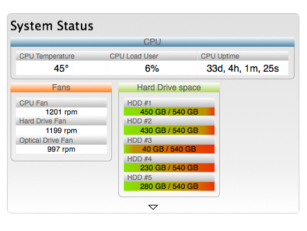
Below is a concept sketch of the new system. It was not about monitoring computer hardware, but I’ve substituted the actual controls for legal reasons.

In this sketch, the monitors have a value field with black-on-white text for maximum visibility. The text size of the value field can also be changed, as can be seen in the group CPU above. The name field is dimmed to further emphasize the value field. With the old version, the users remembered the placement of each monitor and really did not need to read the name of the monitor, just the value.
Some monitors, in this case the ones denoting hard drive space, shows the free space with both numbers and color bars. The more red, the less free space left.
The monitors are grouped in related and color-coded groups. The group name fields and the monitor name fields both have high affordance for direct-manipulation for dragging and dropping as can be seen below.

When dragging a monitor, the group will expand and the other monitors will separate to give room for the dragged monitor. Of course, it is possible to move monitors around within a group as well. Apart from moving monitors, it is also possible to move groups as well as resize groups. An example of resizing groups can be seen below. However, it is not possible to resize monitors.

When moving groups, there is an invisible grid on the background to which the groups snap to for a consistent and clean-looking interface. The groups can be placed anywhere on the background unless the space is occupied by another group, though the groups will be placed equally far from each other. It is possible to place a group between two other groups; the group below or to the left will then move away to make room.
Groups and monitors can also be moved away from the background, to a box for editing groups, as in the sketch below.

You either press the arrow or move a group to that arrow to open the box. Place monitors and groups in the box to hide them. To add a new group, just press the corresponding button in the box. You will be prompted for a name for the group and then an empty group will be created inside the box. To rename an already existing group, just double-click on the group name field and a name change prompt will appear. Monitors can only be hidden, not be removed permanently, but groups can. To remove a group, hover the mouse over the group name field. A button for removing the group will be shown. When removing a group, any content inside it will be moved to the box.

The final result can not be shown here, but preliminary tests with users indicated an increase in effectiveness and efficiency.


Leave a Reply
Want to join the discussion?Feel free to contribute!